India
USA
UAE
Australia
Canada
UI/UX Design & Branding
Data Engineering & Analytics
Custom Ai Solutions
Cloud & DevOps
Digital Marketing
Marketing & Sales Automation
Performance Marketing
SEO & Content Strategy
Analytics & Conversions
CRM Implementation & Integration
Development
SaaS Development
Web Application Development
Native & Cross-Platform Mobile Apps
Enterprise Software Solutions
API Architecture & Integration
Legacy System Modernization
Web Development Services
PropTech & Real Estate
Built a marketplace for seamless property discovery
E-Commerce
We optimize checkout and conversion journeys.
FinTech & Insurance
We build secure, scalable digital flows.
Retail
We enhance shopping and product experience flows.
Portfolio
Case Studies
Blogs
Insights
Recent updates
SEO Audit Tool
Website Comparison
Image Converter
Website Intelligence
SEO Intelligence
Resume Intelligence
Website Auditor
Custom Ai Solution
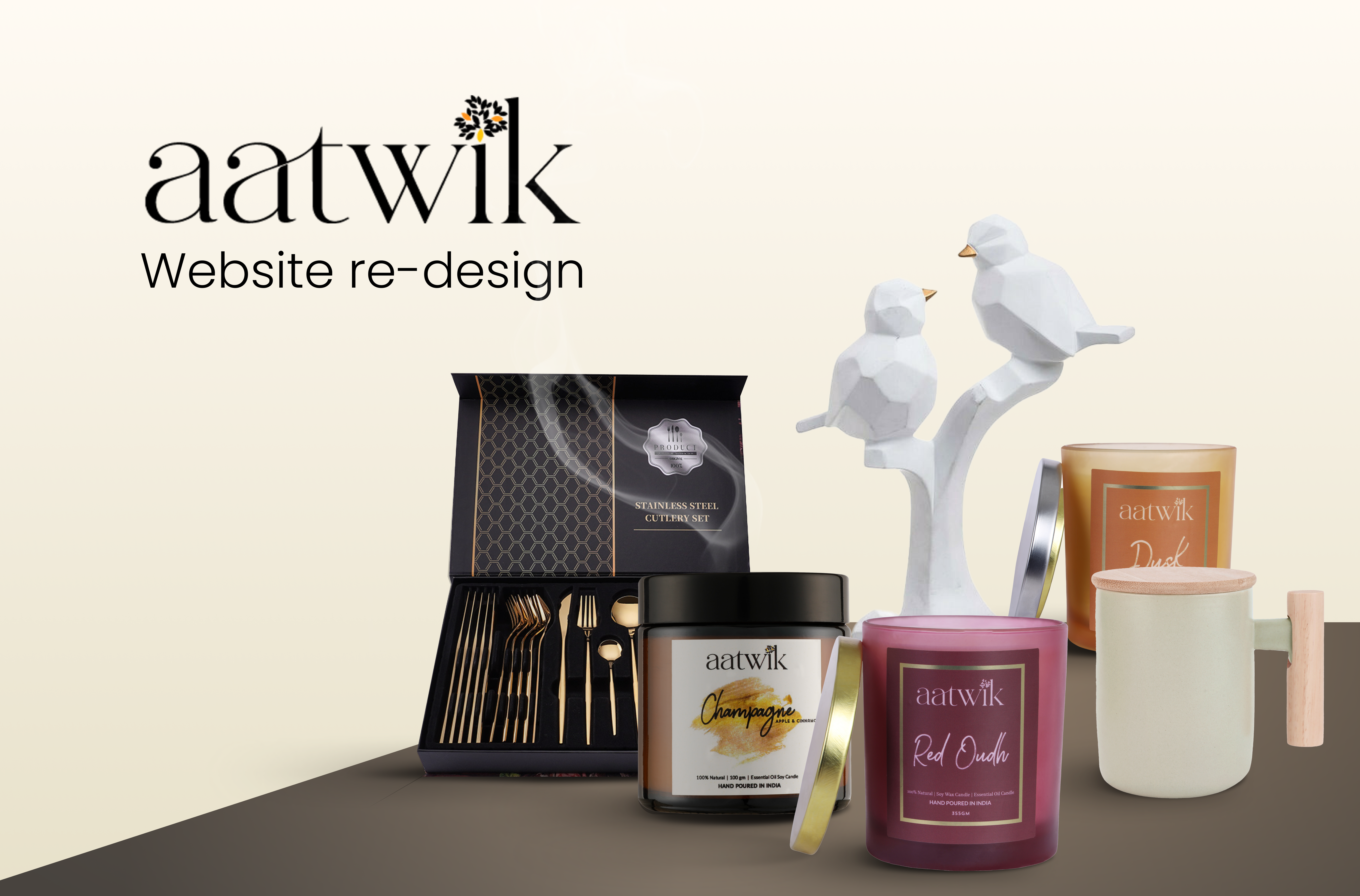
Aatwik
Website redesign
E-commerce
1 month
 Our Work