Designing a Distinctive Brand Identity for “The Good Grains”

Project Overview

Client:

The Good Grains

Industry:

Food & Retail

Scope:

Logo Design, Brand Identity Design

Timeline:

4 days

Context

The Good Grains approached us with a clear mission: to develop a brand identity that would resonate with their target audience while embodying quality, authenticity, and natural goodness. As a company dedicated to sourcing and packaging high-quality grains, they needed a logo that would differentiate them in a competitive market and convey their commitment to providing wholesome, natural products. Our task was to design a visual identity that was simple, memorable, and reflective of their brand values.

Objectives

  1. Create a Unique Brand Mark: Develop a logo that would be instantly recognizable and easily associated with grains, nutrition, and quality.
  2. Reflect Brand Values: The logo needed to embody qualities of health, purity, and reliability, aligning with the company’s mission.
  3. Versatile Design: Ensure the logo was adaptable for various packaging types and digital platforms.

Research and analysis

We began by conducting a comprehensive analysis of the packaging industry, especially brands focused on grains, cereals, and health foods. Competitor logos predominantly used earthy colors, simple typography, and natural symbols such as leaves, wheat, or grain stalks.
Through this research, we identified an opportunity for The Good Grains to position itself as a contemporary, trustworthy, and nature-focused brand.

Design Process

The process involved three main phases:

  1. Concept Development: We brainstormed several concepts centered around the idea of “goodness” in grains. We focused on integrating a natural, approachable aesthetic that would instantly communicate freshness and wholesomeness.
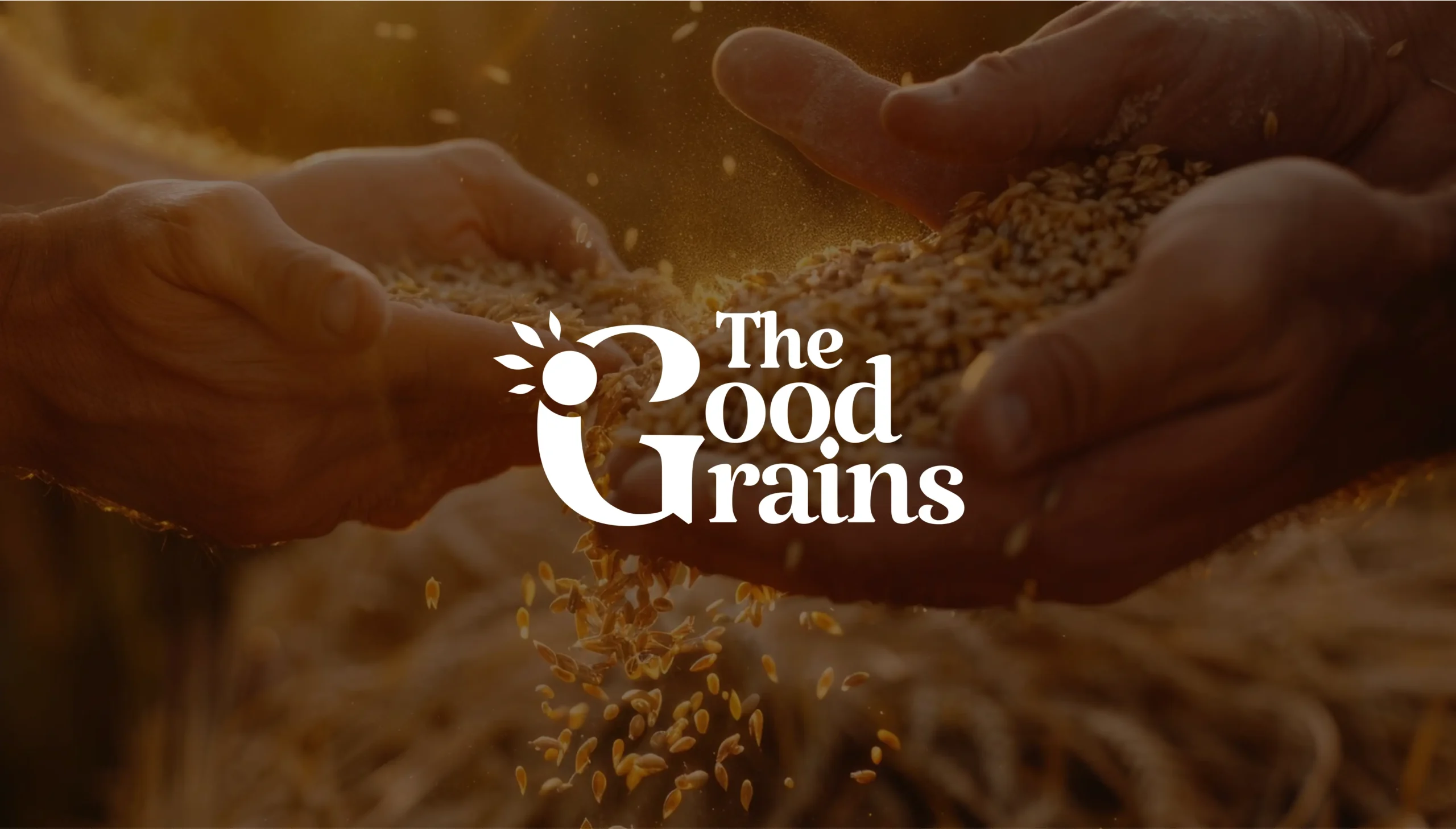
  2. Symbolism and Typography: During the design process, we experimented with incorporating both a grain icon and a sun motif into the central “G” in “Good” to capture the brand’s essence of growth, nature, and vitality. We tested different placements and styles until we found the perfect balance that subtly conveyed these elements. To complement this symbolism, we chose a bold, rounded typeface for its warmth and approachability, blending modern and classic qualities.
  3. Color Palette: The primary color, a deep, warm red-brown, was selected to evoke a natural, earthy tone that aligns with grain products. This color represents the earth, warmth, and wholesomeness, making it perfect for a brand focused on health and natural products. The yellow accents, resembling sun rays, represent vitality and growth, adding a sense of energy and freshness.

Final Logo Design

The final logo for The Good Grains captures the brand’s essence through symbolic simplicity. The bold “G” serves a dual purpose, representing both “Good” and “Grain,” anchoring the brand’s identity in quality grains. The “G” includes a grain-like motif styled as sun rays, symbolizing growth, energy, and vitality—qualities central to wholesome, nutritious products. A clean, bold typeface conveys reliability and simplicity, with “Good” taking prominence to reinforce quality. The deep red-brown background evokes an organic, earthy vibe, while yellow sun accents add warmth, creating an inviting, authentic feel that resonates with health-conscious consumers.

Challenges Faced

One of the challenges we encountered was incorporating a distinct grain element without overwhelming the clean, minimalist style the client wanted. We resolved this by embedding the grain subtly into the “G,” allowing it to be present but not overpowering. Another challenge was selecting a color that would stand out on shelves while aligning with the brand’s earthy, natural vibe.

Results and Client Feedback

The Good Grains team was highly satisfied with the final logo, appreciating how well it captured their brand’s essence. Since the logo launch, the company has reported positive feedback from customers who feel the brand exudes authenticity and reliability. The logo has helped them improve shelf visibility and brand recall, enhancing their market position among health-conscious consumers.

Conclusion

Our work with The Good Grains reflects the impact of thoughtful design in building a brand that resonates with its audience. The logo for The Good Grains is more than just a symbol; it’s an embodiment of their values - purity, quality, and nourishment. By focusing on simplicity and symbolism, we created an identity that stands the test of time and effectively communicates the brand’s commitment to providing “good” grains.

Through this project, Noseberry Digitals reinforced the power of strategic design in brand building, especially for companies in the natural products sector. This case study highlights our dedication to creating impactful brand identities that connect with audiences on a deeper level.