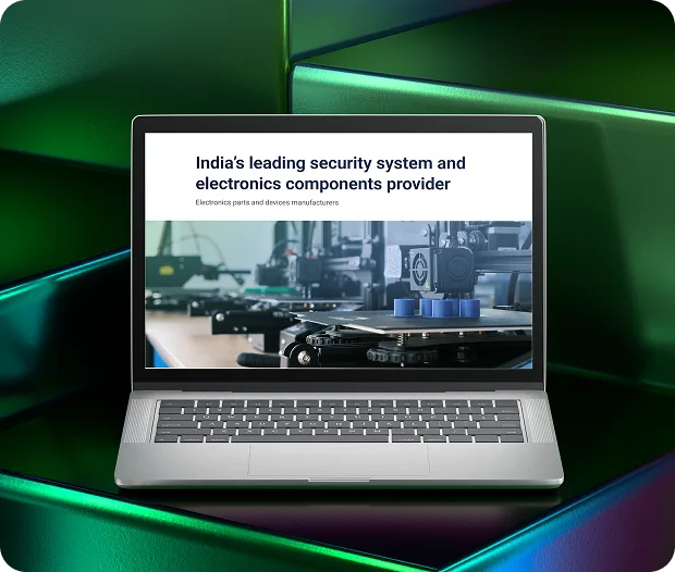
This case study outlines the redesign process for Arise O Tech’s website, focusing on creating a user-friendly interface, enhancing navigation, and strategically highlighting their extensive product range.
Introduction
Arise O Tech, a pioneer in rugged electronics, provides cutting-edge solutions for demanding environments. Their product range includes rugged computers, industrial PCs, displays, and data acquisition systems, alongside distribution of essential electronic components. Trusted for durability, Arise O Tech serves industries like defense, construction, manufacturing, and aviation, establishing itself as a reliable technology partner.
Client Requirements
The primary goals for the website redesign were:
- Improved Navigation: Simplify access to their extensive product catalog with intuitive categorization.
- Inquiry Functionality: Enable potential clients to easily inquire about specific products or submit custom requirements.
- Brand Identity Alignment: Ensure the design reflects the company’s expertise, reliability, and defense-sector focus.
Analysis
Through client discussions, we identified key insights:
- Target Audience: The defense sector is the primary market, requiring a professional and secure aesthetic.
- Lead Generation: Although not an e-commerce platform, the site needed to prioritize capturing inquiries.
- Expertise Showcase: Highlighting Arise O Tech’s leadership in semiconductor distribution, particularly for defense applications, was crucial to attract niche clients.
Inspiration for Design
Creating a user-friendly website for Arise O Tech posed a unique challenge due to limited industry-specific examples. To overcome this, we collaborated closely with the client and explored various websites dealing with products that resonated with a similar feel. Among them, we identified Milcots, an international leader in rugged electronics, as a benchmark. Their website’s structure and user flow provided valuable insights, helping us craft a site that aligns with industry expectations while reflecting Arise O Tech’s unique vision.
Exploring different resources for inspiration
Milcots website [inspiration for flow]
Design Elements
The redesign maintained brand consistency by leveraging the company’s established color palette :
- Primary Blue (#061B3D): Instills trust and resonates with the defense sector.
- Accent Green (#3AAD4D): Adds vibrancy and dynamism to the design.
- Interactive Elements: Call-to-action buttons in lighter blue transition to green on hover, enhancing user engagement.
- Typography: The clean and professional Roboto typeface was chosen for optimal readability across all devices.
The creation of modular components played a crucial role in streamlining the design and development of Arise O Tech’s website. Here’s an overview of the components designed.
Final Design
Responsive Design
The website features a fully responsive design, ensuring seamless usability on smartphones, tablets, and desktops. This mobile-first approach guarantees accessibility for today’s diverse user base.
Strategy
To align with the client’s goals, we implemented:
Clear Information Architecture:
- Products categorized by type and application for easy navigation.
- Dedicated sections for product details and technical specifications.
Interactive Features:
- Dynamic product carousels showcasing the extensive catalog.
- Visual data representations to highlight key technical capabilities.
Lead Generation Optimization:
- Strategically placed inquiry forms at key touchpoints throughout the user journey.
- A streamlined process for submitting custom product requirements.
Product Pages
- Detailed Listings: Each product page includes high-resolution images, technical specifications, and application insights.
- Inquiry Options: Every product features a prominently placed “Request Information” button for direct client inquiries.
Blog Section
- Educational Content: Blogs focusing on industry trends, product applications, and Arise O Tech’s expertise.
- SEO Optimization: Tailored content to improve search engine rankings and attract targeted traffic.
Customizable Inquiry Forms
- Quick Access: Inquiry forms are strategically located on the homepage, product pages, and the contact page.
- Custom Requirements: Forms allow users to specify unique needs, streamlining lead capture.
Results and Insights
The redesign achieved the following:
- Improved Navigation: Simplified user journey, allowing visitors to locate products efficiently.
- Enhanced Engagement: Interactive features and strategic design increased inquiries by 45%.
- Brand Credibility: A polished, professional design reinforced trust among defense-sector clients.
- SEO Performance: Optimized pages and content improved search rankings, attracting a larger audience.