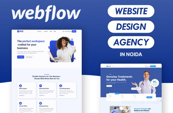
 Our Services
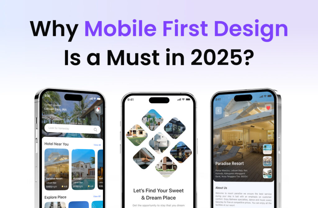
In 2025, users aren’t sitting at desks—they’re browsing, shopping, and interacting from the palms of their hands. Whether you run an eCommerce store, a SaaS platform, or a B2B service, your customer’s first interaction is likely on mobile. That’s why mobile-first design is no longer a “nice-to-have”—it’s a business-critical strategy. In this blog, we’ll break down the essentials of mobile-first design, the business impact, common mistakes, and how the best website design & growth marketing agency can help you build digital experiences that perform, convert, and grow.
What Is Mobile-First Design?
Mobile-first design is the approach of designing your digital product—website or app—starting from the smallest screen (mobile) and then scaling up to tablets and desktops.

Unlike the outdated desktop-first model, mobile-first prioritizes:
- Essential content
- Fast performance
- Clean, focused UX
- Cross-device adaptability
With over 65% of global web traffic coming from mobile devices, this approach ensures your business meets users where they are.
Key Features of a Mobile-First Website
- Core Content First: Show only what users need. Add enhancements for larger screens later.
- Thumb-Friendly UI: Buttons and links are easy to tap with one hand.
- Optimized Media: Use lightweight images and SVGs to load fast on mobile networks.
- Simple Navigation: Use hamburger menus, collapsible sections, and bottom navigation tabs.
- Progressive Enhancement: Start to lean, then enhance. Never design big and shrink down.
Business Benefits of Going Mobile-First
1. SEO Boost
Google now uses mobile-first indexing, which means your mobile site is the version that gets ranked. If it’s slow or broken, you’re losing visibility—regardless of how great your desktop version looks.
2. Better User Experience = Higher Conversions
A smooth mobile experience means more clicks, form submissions, and purchases.
3. Competitive Edge
Your competitors are fighting for the same small screens. Mobile-first design shows your brand is modern, professional, and trustworthy.
4. Real-Time Conversions
From cafes to commutes, users convert on the go. A mobile-optimized site ensures they can do that anytime, anywhere.
Common Mobile Design Mistakes (and How to Fix Them)
Mistake 1: Designing for Desktop First
Fix: Start with mobile wireframes. Prioritize CTAs and thumb-friendly navigation.
Mistake 2: Using Heavy Media
Fix: Compress images, use WebP format, and lazy-load videos.
Mistake 3: Tiny Tap Targets
Fix: Place buttons within natural thumb zones and use enough padding.
Mistake 4: Poor Font Choices
Fix: Use responsive typography starting at 16px+ with high contrast.
Mistake 5: Skipping Device Testing
Fix: Test on real devices and simulators. Use tools like Google Mobile-Friendly Test and BrowserStack.
How the Best Website Design & Growth Marketing Agency Fixes It All
Partnering with a team like Noseberry Digitals means you get more than just good design—you get:
- Mobile-first wireframes & user flows
- Lightning-fast loading speeds
- Fluid, responsive design systems
- Cross-device compatibility testing
- SEO-friendly structures for better rankings
They bring together design, development, and marketing to build mobile experiences that convert.
Mobile-First vs Responsive Design: Know the Difference
| Feature | Responsive Design | Mobile-First Design |
| Starting Point | Desktop | Mobile |
| Performance | Slower on mobile | Fast & optimized |
| UX Focus | General layout | Thumb & scroll-friendly |
| SEO Benefits | Moderate | High (Mobile-first indexing) |
Mobile-first isn’t just responsive. It’s proactive, strategic, and user-centric.
SEO and Mobile UX Go Hand-in-Hand
- Google rewards mobile speed and usability via Core Web Vitals
- Clear structure = easier indexing
- Lower bounce rates = stronger engagement signals
The result? Higher rankings, more traffic, and increased conversions.
How to Get Started with Mobile-First Design
- Audit Your Current Site
Use Google’s Mobile-Friendly Test to check speed, layout, and usability.
- Understand Mobile User Intent
Look at your analytics. What do mobile users want? Make it easy to access.
- Simplify Content Hierarchy
Start with what matters: headlines, CTAs, benefits. Remove distractions.
- Partner with Experts
Work with a Best website design & growth marketing agency like Noseberry to plan and execute your transformation.
- Test & Optimize
A/B test layouts, run heatmaps, and continuously iterate based on real behavior.
Expert Opinion
“Mobile-first isn’t just a trend—it’s how successful brands grow in a mobile-dominated world. Focused design, fast performance, and SEO-ready structure—it all starts here.”
— Noseberry Digitals
Conclusion: Growth Starts with Mobile
A mobile-first approach ensures your brand shows up where it matters most—on mobile screens. It impacts not just design, but SEO, conversions, and business growth. By partnering with a trusted Best website design & growth marketing agency, you’re not just building a website—you’re building the foundation for long-term digital success.
FAQs: Mobile-First Design
Q1. Is mobile-first only for eCommerce websites?
No. It benefits all industries—from SaaS to B2B—because mobile usage is universal.
Q2. How does mobile-first impact SEO?
It improves rankings via better load speed, usability, and mobile indexing.
Q3. Can I upgrade my current site to mobile-first?
Absolutely. Start with an audit and redesign in phases with expert help.
Q4. How long does it take to launch a mobile-first redesign?
Typically 4–8 weeks, depending on complexity.
Q5. What tools help with mobile-first testing?
Use Google Lighthouse, BrowserStack, and Hotjar for insights and validation.